If you’ve ever looked at two character sketches with similar anatomy and wondered why one instantly grabs you while the other feels flat, you’ve bumped into the principle of appeal. Appeal isn’t just “cuteness” or “style.” It’s clarity, charm, and design choices that make a character irresistibly readable. As an adult learning animation and design, I’ve found that focusing on appeal early turns awkward drawings into characters people connect with.
What Is “Appeal” (Really)?
In classical animation, appeal is one of the twelve core principles: the quality that makes a character pleasant and compelling to look at. Practically, it’s a mix of strong shapes, clear silhouettes, thoughtful contrasts, and personality choices that guide the viewer’s eye. Good appeal makes the design understandable at a glance and interesting on a second look.
Why Appeal Matters in Character Design
Appeal is audience-first design. It helps the viewer instantly decode who the character is, how they move, and what energy they bring to a scene. That pays off in thumbnails, turnarounds, and animation because the design supports performance instead of fighting it.
Core Ingredients of Appeal
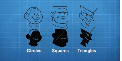
- Shape language with intent. Circles feel friendly, squares feel stable, triangles feel sharp or mischievous. Commit to shapes that match personality.
- Clear silhouette. If the pose reads in black, it will read in motion. Remove tangents and merge overlaps to keep the outline clean.
- Asymmetry over sameness. Stagger features, vary widths, and offset angles. Symmetry is for model sheets; asymmetry is for life.
- Rhythm and line of action. Use S and C curves to lead the eye through the design and create flow that feels alive.
- Contrast with control. Big vs small, straight vs curve, thick vs thin; contrast adds interest when used deliberately.
- Simplicity that serves personality. Remove any detail that doesn’t sell the character’s story at first read.
Appeal isn’t a single trick; it’s a handful of choices that align around personality, readability, and taste.

Use the diagram above as a quick checklist: choose a primary shape language, push the line of action, check the silhouette, and add contrast where the eye needs emphasis.
Common Appeal Killers (and Quick Fixes)
- Mirror symmetry everywhere. Fix: tilt features, vary spacing, and offset angles to break the mirror.
- Tangent tangles. Fix: separate overlapping forms and give shapes breathing room along the outline.
- Detail overload. Fix: simplify. Keep only what sells personality or function at first read.
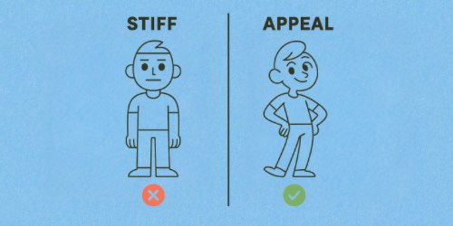
- Neutral stance, neutral face. Fix: add a clear attitude in posture or expression—even tiny changes help.
If a design lacks appeal, look for sameness and clutter; replacing both with clarity and contrast works wonders.
Practical Exercises to Build Appeal
- Silhouette pass. Fill your sketch black and adjust until the character reads instantly from the outline alone.
- Three-shape remix. Redraw the same character using mostly circles, then mostly squares, then mostly triangles—compare vibes.
- Asymmetry audit. Mark every pair of “the same” and offset one: eyes, shoulders, hips, hair masses, accessories.
- Rhythm sweep. Trace the main S/C curves from head to toe; add straights to support the curves, not fight them.
- One-change push. Keep the design but exaggerate a single idea (head size, posture, or feature spacing) to find a stronger read.
Small, repeatable drills like these turn appeal from a fuzzy concept into muscle memory you can trust.

The comparison above shows how tiny choices—offsets, clearer line of action, and shape contrast—turn a stiff sketch into a design with personality and charm.
Want a structured way to level up appeal, posing, and silhouettes—without guesswork?
Final Thoughts
Appeal is clarity with a point of view. When you commit to bold shapes, readable silhouettes, and rhythms that fit personality, your characters start “speaking” before they move. Keep the audience’s eye in mind, make one strong choice at a time, and let the design do the talking.


