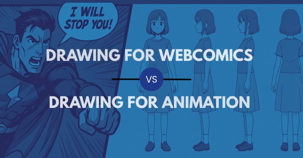
It’s late at night and you’re sketching your character for the tenth time, coffee cup pushed aside, sketchbook filling up. You stop and realize something strange—the way you draw changes depending on whether you imagine them living in a webcomic panel or moving in animation. That single shift changes how your lines look, how much detail you add, even the way you think about their story.
Different Goals, Different Constraints
If you’re drawing for a webcomic, you’re creating a single moment that has to land instantly with your reader. If you’re drawing for animation, you’re building something that has to survive motion across dozens of frames. Thinking about which one you’re aiming for up front will keep your choices sharper and your drawings easier to finish.
When you understand what each medium demands, you stop fighting the format and start working with it—your art will feel clearer, faster, and more intentional.
That’s why the first big shift is mindset: ask yourself whether you’re aiming for “panel drama” or “motion clarity,” and the rest of your decisions will start to fall into place.
Webcomic Drawing Priorities
Picture your reader scrolling on their phone. They see your panel for maybe three seconds—if it doesn’t read instantly, they’re on to the next update. That’s why drawing for webcomics is all about boldness, readability, and rhythm. Here’s what to keep in mind:
- Readability at phone size: Big shapes, strong silhouettes, and simple value groups so the beat pops instantly.
- Line weight and texture as voice: Play with varied strokes, hatching, and spot blacks to create mood and drama.
- Panel composition: Guide the eye with gutters, balloons, and contrast so text and image feel like one unit.
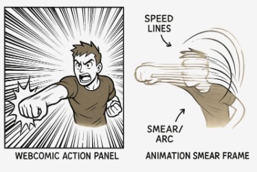
- Moment design: Treat each panel like a punchline or reveal; imply motion with speed lines and bursts.
- Production cadence: Build workflows you can repeat without burning out—consistency matters more than perfection.
Think of it this way: if one panel can hold your reader’s attention on a tiny screen, you’ve done your job.
That little shift keeps you focused on what your reader experiences, not just what looks cool on your page.
Animation Drawing Priorities
Now flip the scenario. Instead of a panel, imagine your drawing as one of 200 frames in a short sequence. Could you keep it consistent from frame to frame? Could someone else in a studio match your line? Animation is about economy and structure—choices that let a character survive motion. Here’s what to practice:
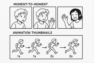
- Line economy: Clean, minimal strokes that reduce wobble and make in-betweens manageable.
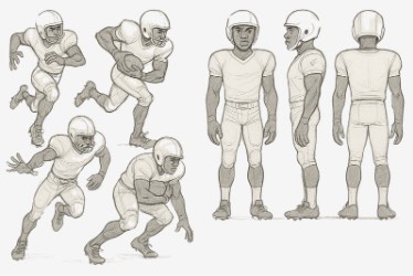
- On-model structure: Clear construction shapes and steady proportions keep characters recognizable.
- Pose clarity: Strong silhouettes carry the action before details even kick in.
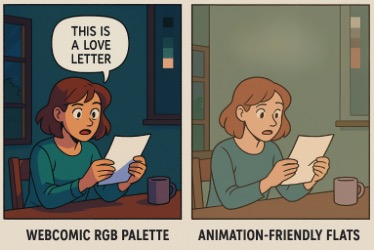
- Value simplicity: Flats and restrained palettes keep painting consistent across shots.
- Timing awareness: Drawings serve spacing and arcs; smears and overshoots are tools, not extras.
Ask yourself, “Could I draw this pose 50 times?” If the answer is yes, you’re thinking like an animator.
Seeing your drawings this way makes the “why” behind simplicity click—it’s not boring, it’s survival for motion.
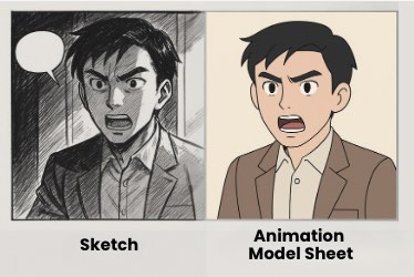
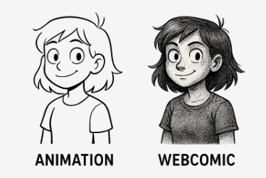
Line, Detail, and Texture
Back at your desk, maybe you switch pens. In your webcomic sketch, you lean into shadows and hatching; in your animation sketch, you strip everything back to clean contours. One is about impact in stillness, the other is about efficiency in movement. Neither is wrong—it’s just about matching the style to the medium.
That experiment—one drawing in two styles—teaches you faster than hours of theory.
Conveying Motion Without Motion
Webcomics don’t have moving frames, but they have gutters and panel transitions. Animation has true motion but needs tricks like smears or multiples to show speed. Both are visual grammars you can study and borrow from, as long as you adapt them to fit your format.
You’ll start to see that “motion” isn’t one thing—it’s a set of tricks artists pick depending on the audience.
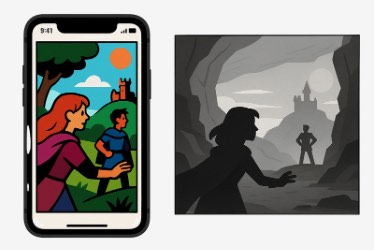
Color and Value Strategy
Think again about your reader. If they’re on a phone, your comic needs bold contrasts and clear text balloons. If they’re watching an animation, your palettes need to stay consistent across lighting and effects. The color choices aren’t just aesthetic—they’re functional.
Match your values to the medium and your drawings will always feel smoother and more intentional.
Putting It Into Practice
Try this exercise tonight: take one character and draw them once for a comic panel and once for an animation pose. Switch your lines, simplify your values, or add texture depending on the version. Doing both back-to-back is how your brain starts to switch gears automatically.
Repeat this a few nights in a row, and the “what am I drawing this for?” question will stop being confusing—it’ll become a skill you use on demand.
Want structured drills that walk you through both webcomic and animation workflows step by step?
Master Animation Faster with Bloop Courses

Learn the Art of Animation— Step by Step

Final Thoughts
That late-night sketch you started with? It could live in a webcomic or in an animation scene—what matters is knowing which choices make it shine in each. If you pick the right priorities for the job in front of you, your drawings will read better, animate cleaner, and feel more professional. In the end, it’s not about choosing one path forever, but about learning to adapt. That’s what makes you versatile as an artist.


